Food Styling 101
It's time you stepped up your Instagram game.
The pre-meal photo shoot has become a global, cross-cultural, cross-generational phenomenon. A cult-like ritual that begs the philosophical question: if there is no photo, did it really happen? Food itself is art, but it has also been the subject of art for millennia. From discoveries of caveman paintings and Egyptian hieroglyphs depicting food, to its central presence in Renaissance paintings, to modern representations; it’s in fact one of the first subjects of novice illustrators and painters. Social media is simply a new medium, accessible to the masses.
Food photography and the sharing of food photos is as aspirational as it is relatable. We follow international celebrity chefs on Instagram dreaming of the day we can afford a $600 meal in Copenhagen as much as we live vicariously through food porn accounts or look for recipe inspiration for dinner.
These days, everyone is a food photographer. But what sets the influencer apart from the amateur? We are constantly complimented for our food photos, which are taken by fellow Spoon and Artistic Director, Abhishek Dekate. An avid Instagrammer turned influencer, Abhi tells stories through his lens - and therein lies the difference.
In addition to the compliments, Abhi gets an abundance of questions from those eager to fine tune their food photography skills. We’ve decided to share his wealth of knowledge and experience with those of you who wish to step up your Instagram game.
Finding your Voice
Set the Tone
Are you a light and bright or a dark and moody? For Instagrammers who are in it for the long run, the subjects and composition of their photos might change, but there is often little variance in the underlying tone from one photo to the next. A general look and feel is established early on and the tone is carried through like a trademark. This is part of their brand and marketers choose influencers who naturally match their branding, rather than the other way around.
Now, as a hobbyist, there is no reason to force yourself to set a tone and stick to it. However, you might begin to see a pattern in your habits and if you do, why not explore deeper into that side of you?
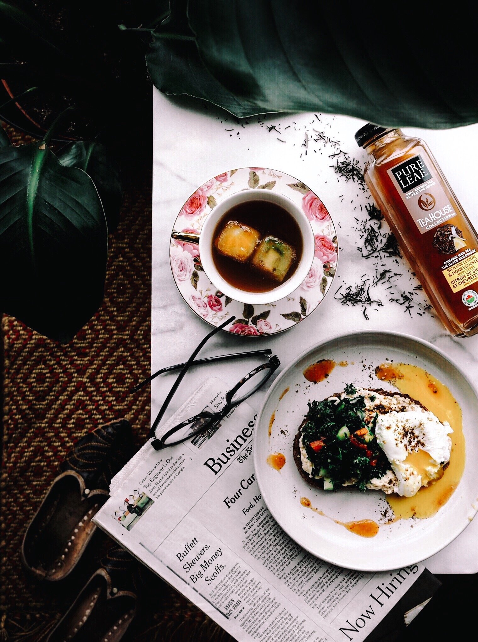
While there definitely are nuances within tones, the simplest way to explain this is by using light vs dark.

Light Tone
A light & bright tone uses light wood or bright coloured surfaces with a smooth finish. Colour schemes dabble mostly in pastels. Everything looks organized, new, and clean, including props or tools.

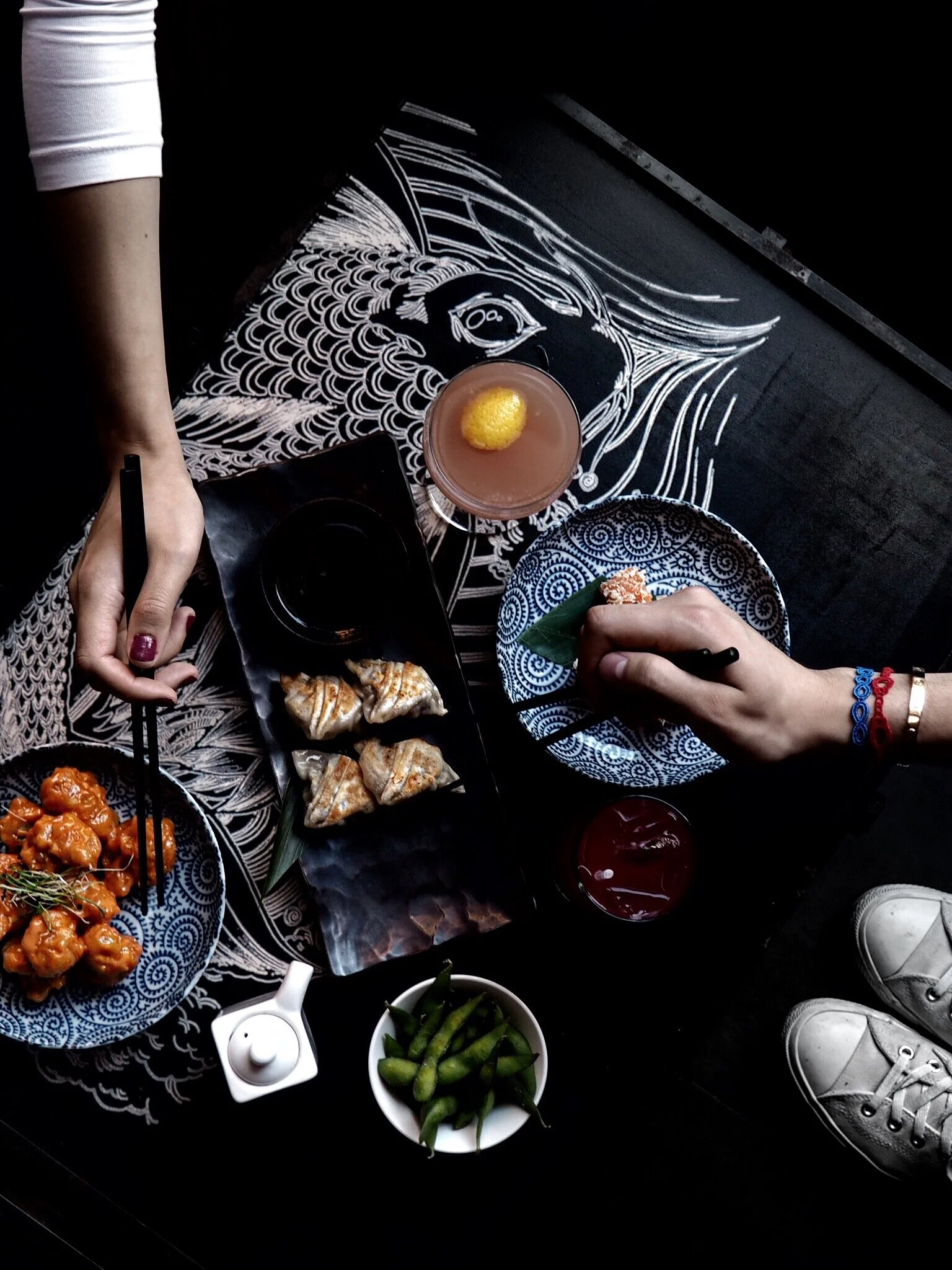
Dark Tone
Dark and moody uses rustic surfaces, such as dark wood and distressed metal. Colour schemes use varying levels of earthy colours and grayscale. Everything looks used, temperamental, and dramatic.
Your Signature
If you want to go a step further, determine your signature. It's an extension of who you are; something that defines your personality. This can be a recurring theme using a particular type of surface, tools or props, colour scheme, or even a signature filter.
Composition
Composition is the story you want to tell. With the purpose of your photo in mind, create an ambiance or visual concept.
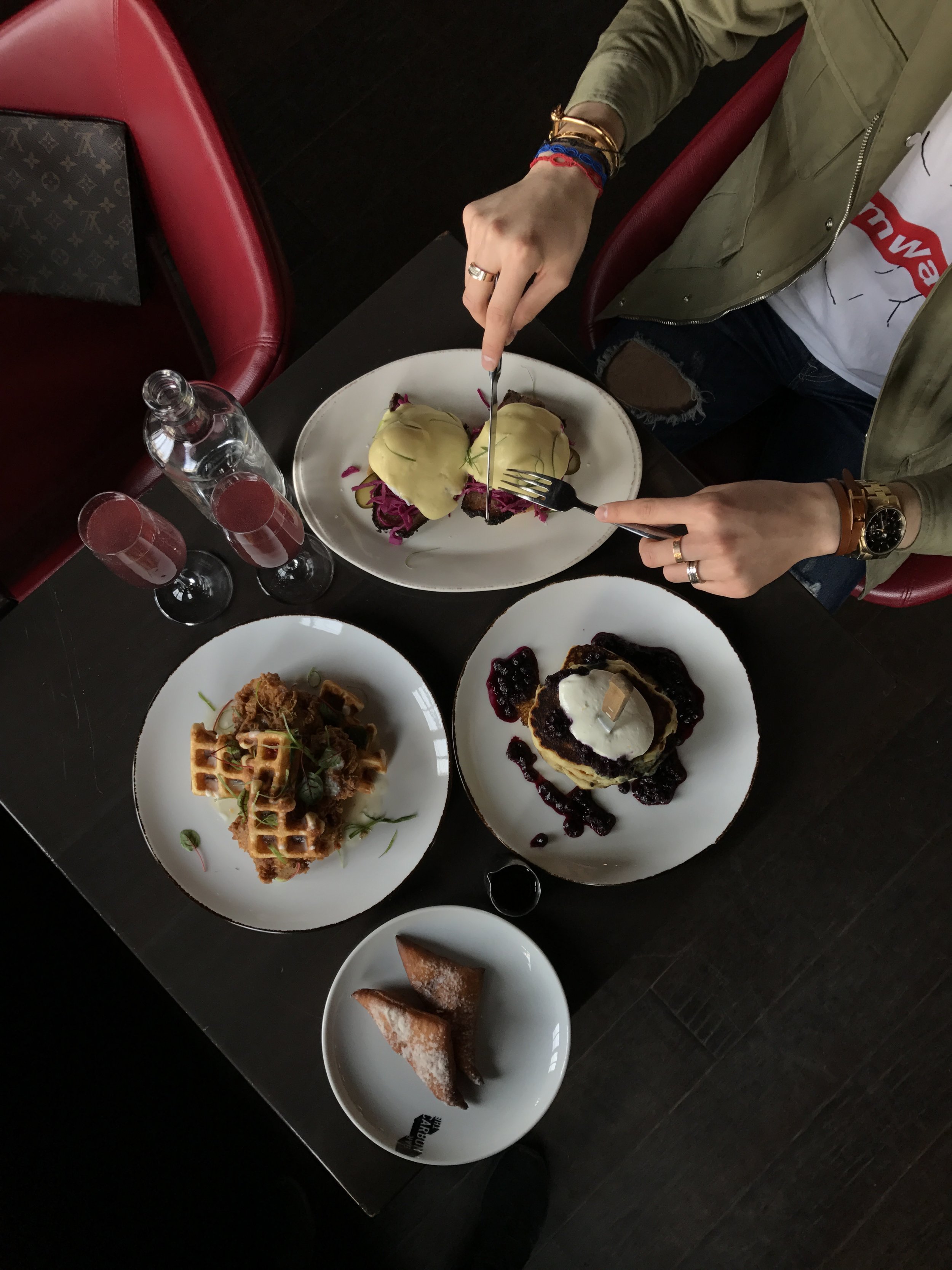
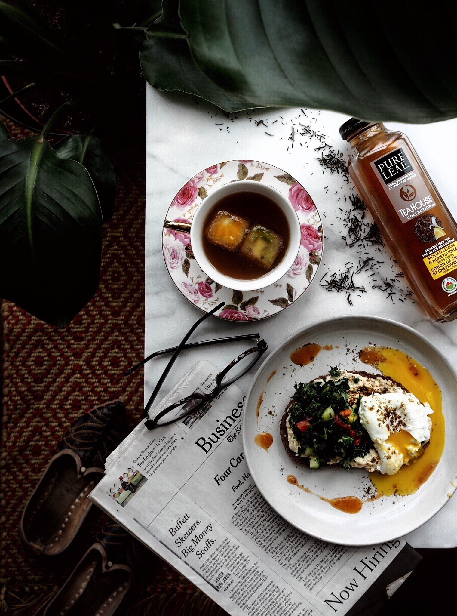
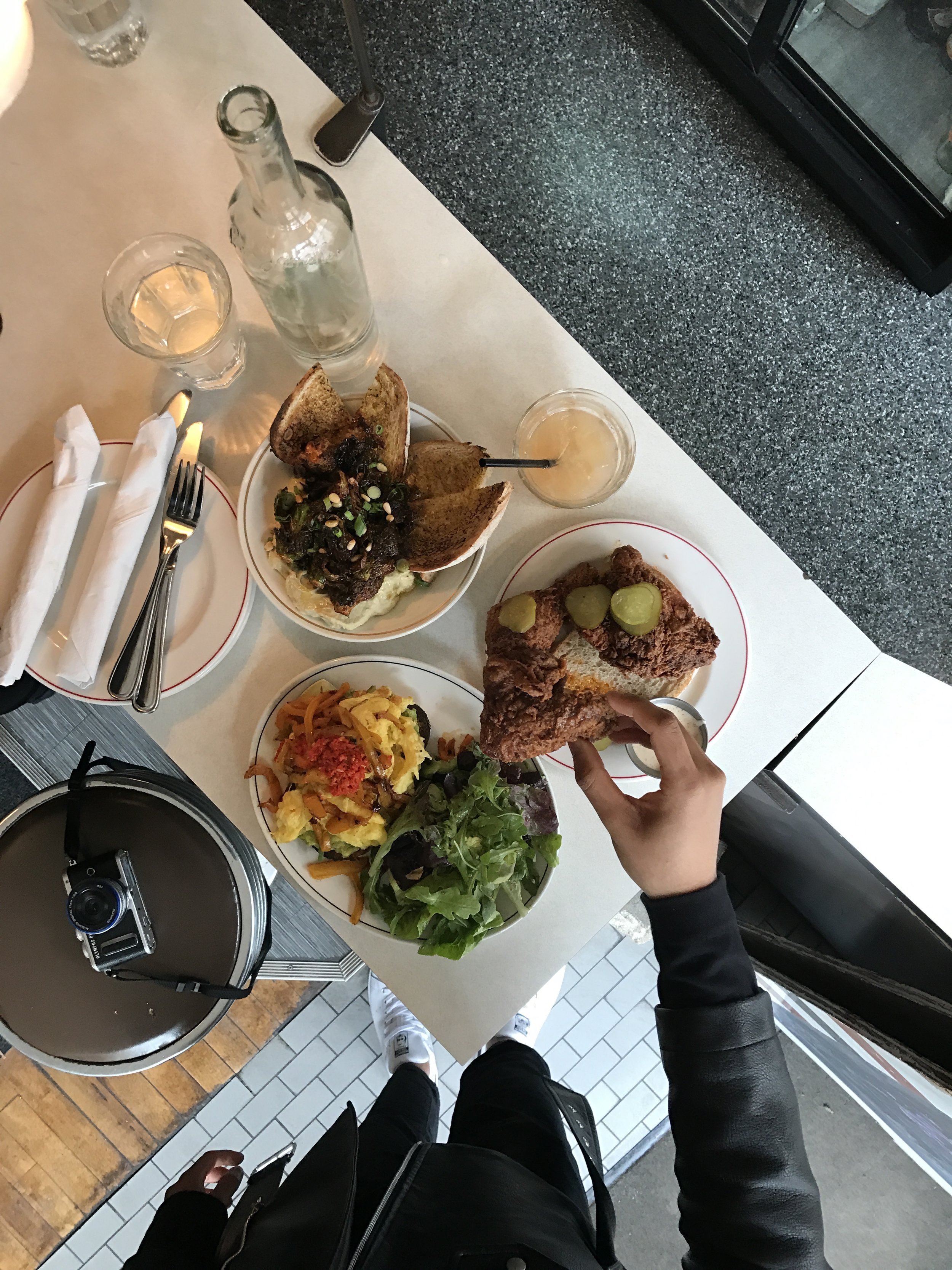
If you want to share a great dish you had in a restaurant, you will likely stick to a more minimalist approach, with the dish itself as the star, accompanied by very little drinks or cutlery.
If your goal is to share a recipe or tell a story about the dish, chances are that it will overflow beyond your plate. Pick and choose ingredients, tools, and accessories you want to include with your story in mind. For visual representations of the process, think of using fresh ingredients that what into the dish and tolls used to make it.
Finally, for an additional layer of relatbility, add an element of action. I’ve often hand-modeled for Abhi, either by showing an action in creating the dish, or by digging in to show my excitement in eating it!
Negative Space

As the old adage goes: sometimes less is more. Sometimes the food speaks for itself - there is no need for the trendy organized chaos of a busy flatlay. Sometimes, a clean, minimalist surface offers you an opportunity to play with asymmetrical compositions, angles, and depth.
Negative space is an invitation for the audience to fill in the rest of the greater picture. Abhi begins with placing the main subject in the center of the frame, then shifting it depending on how it looks on camera. If the subject is the plate, decide how you want to frame it. You might want to tease people with what’s on it by revealing only a portion of the plate and leaving the rest up to the imagination.

Lighting
If you’re just starting out, take advantage of natural daylight - it’s free! It’s also probably the best lighting you can rely on, considering there are so much equipment out there that is meant to replicate natural lighting.
Then, for those ready for the next step, Abhi recommends investing in a reflector. This sheet of reflective material will allow you to manipulate daylight to create different effects. It gives you more of a studio feel, since you can reflect shadows and add more light to your surface.
Finally, there's the tools of a professional photographer. Lightboxes are near essential for achieving that floating in space look often associated with professional product shots. For more detailed compositions, such as the flat lay style often featured on The 3 Spoons, a 3-point lighting rig will allow for daylight-quality even when the sun won't cooperate with your shooting schedule. But buyer beware, however: these options bought off the shelf can range from expensive to downright princely. The good news is that there are numerous online resources for DIY projects perfect for your new at-home studio - just search around.
Invest in a good Camera

There was a time when Instagram photos were mostly shot with the smartphone of the moment, but that is no longer the case, especially with Instagram influencers. No matter how good phone cameras have gotten, they often don’t hold up to a DSLR.
If you are looking to explore a career in food styling, Abhi highly recommends investing in a camera. There are many good cameras on the market and the body doesn’t quite matter. The investment should be put into the lens.
For flatlays, Abhi recommends a 17mm or a 25mm. These lenses allow you to concentrate on a focal point without completely blurring the rest of the image.
For high quality portraits, use a 45mm or a 50mm. These focus on a specific subject and will blur the background. This allows for more depth in your shot and is highly recommended for more angular versus top-down shots.
Post Processing
#NoFilter exists because, frankly, it’s rare to find a photo that hasn’t been touched up in one way or another. While you may not use filters, the conditions might not have been the best when you tried to snap that dish you wanted to share. If you're fortunate enough to have the cash on hand for a Photoshop or Lightroom license - go for it. There's a reason they are the reigning photo editing applications. But for those just starting out, or on a budget, there are a whole host of significantly cheaper apps that can get you most of the way. Here are some apps Abhi uses in enhancing his photos.
Google Snapseed (Free)
Google Snapseed is essentially Photoshop-lite for your phone. This basic app allows you to adjust brightness, contrast, saturation, and shadows. Use it to elevate your photo and enhance the mood you’re going for.
For instance, if there are a lot of shadows in your shot, you can adjust these by making them darker or brighter. You can also use the Brush tool to selectively saturate or de-saturate specific parts of the photo if it wasn’t well captured with your lens. The Brush tool typically brings out the colours in food. You can use the Dodge and Burn brush to either brighten or darken parts of the frame.
Notice the difference in sharpness and contrast between the before and after photos to the right.
VSCO (Free)
This app exists solely for filters. It comes with a set of free filters, but depending on the tone you’re going for, you might want to opt into investing in different filter packs. If you’ve ever wondered why someone always seems to achieve a perfectly pastel colour palette or a consistent pink-ish hue on their photos, there’s a 99% chance they’re using a VSCO filter. Filters are, again, one way for you to add a cohesive element to all your photos.
The after photo has a discernible pink hue compared to its predecessor. You'll notice that VSCO filters are much more subtle than your standard Instagram filters, which can sometimes affect the overall quality of the image.
FaceTune (Paid)
If you’re willing to invest in the ability to bring out specific details in your shot, this app is it. Facetune offers a Details feature that can fix blurry elements of your shot that you want to focus on. There’s also a Smooth feature that allows you to smooth out grainy parts of our frame. The app also allows you to remove objects from your photo with its Heal feature, which can erase these from the photo altogether.
In the after photo, the yellow lighting reflected on the table and the blue hue on the white floor tiles have been removed to reveal clean white surfaces. The food has also been treated with sharper detail.
If you are interested in more hands-on instruction, we are proud to announce that Abhi will be teaching a workshop on flat lays on May 27th, in collaboration with Embiria and Bombay Street Food. See details here.
Words by Kimberley Kwo, content and photos by Abhishek Dekate.